Rambler Redesign
Rambler Redesign
Rambler Redesign
Rambler Redesign
Rambler Redesign
About
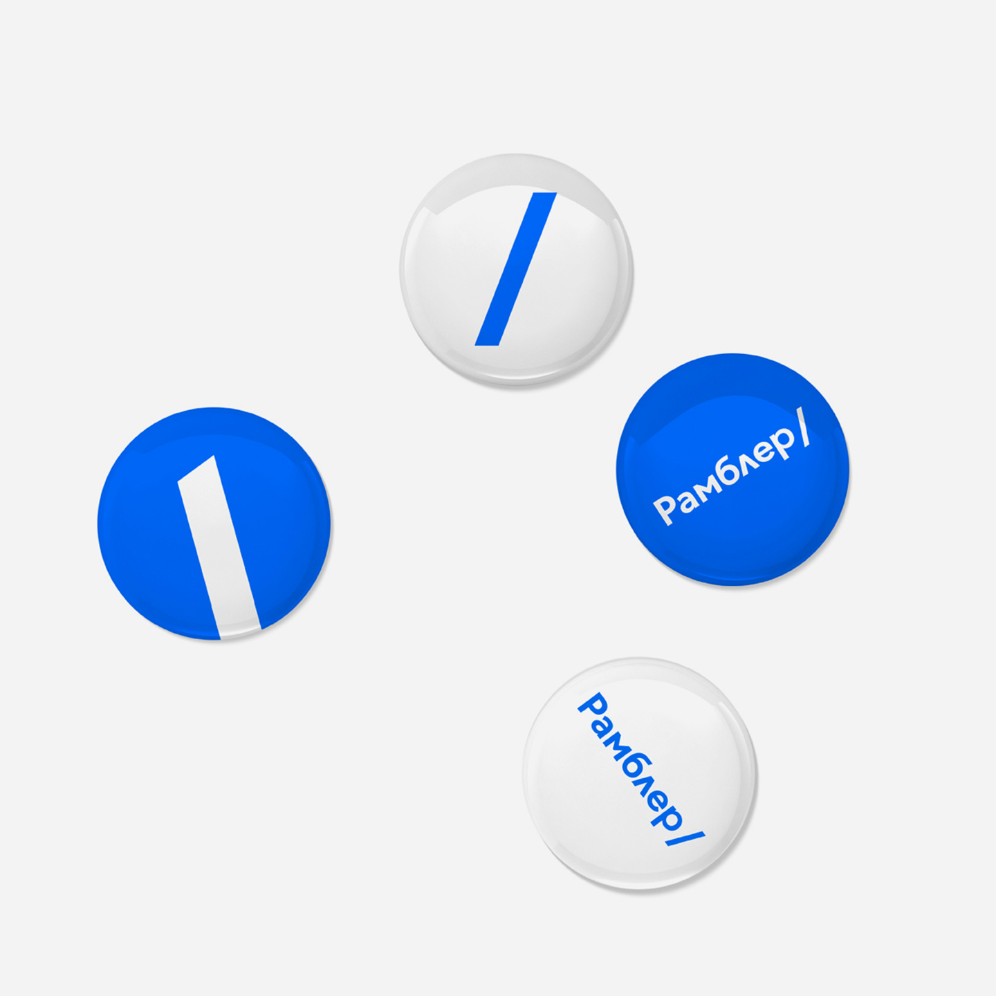
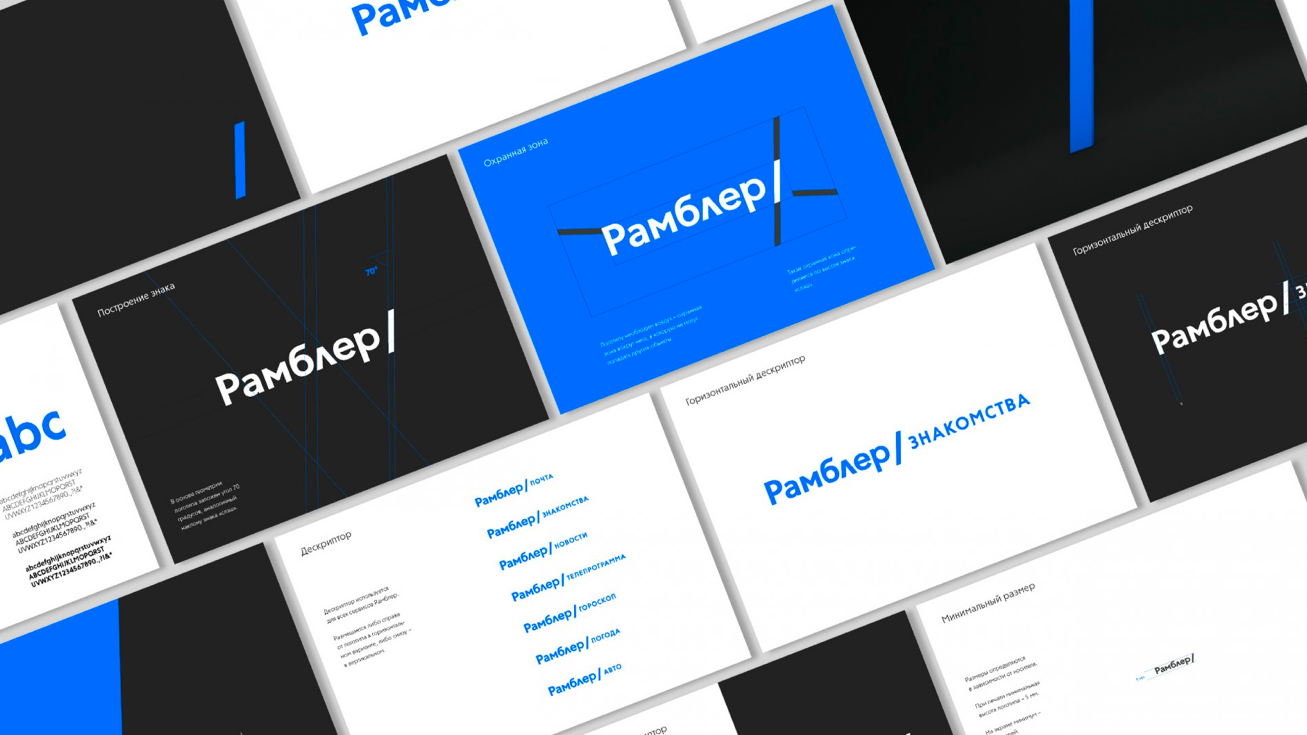
Working in collaboration with the ONY agency, we developed a concept of a redesign for one of the largest IT holding in Russia. The metaphor of the logo is based on the slash — one of the common elements of the Internet address. The symbol exposes a new strategy where Rambler becomes a portal where a user starts his internet journey
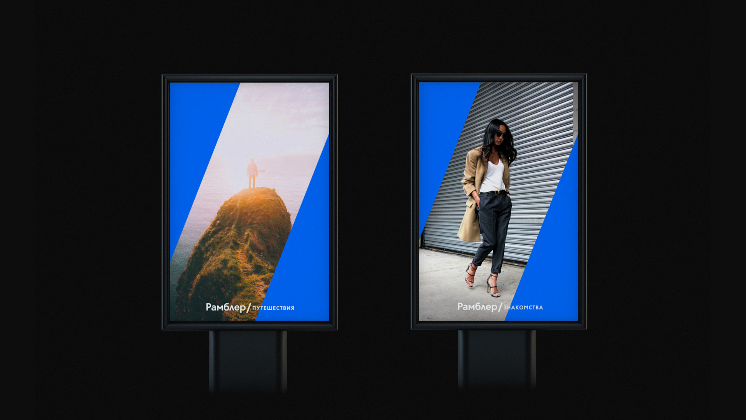
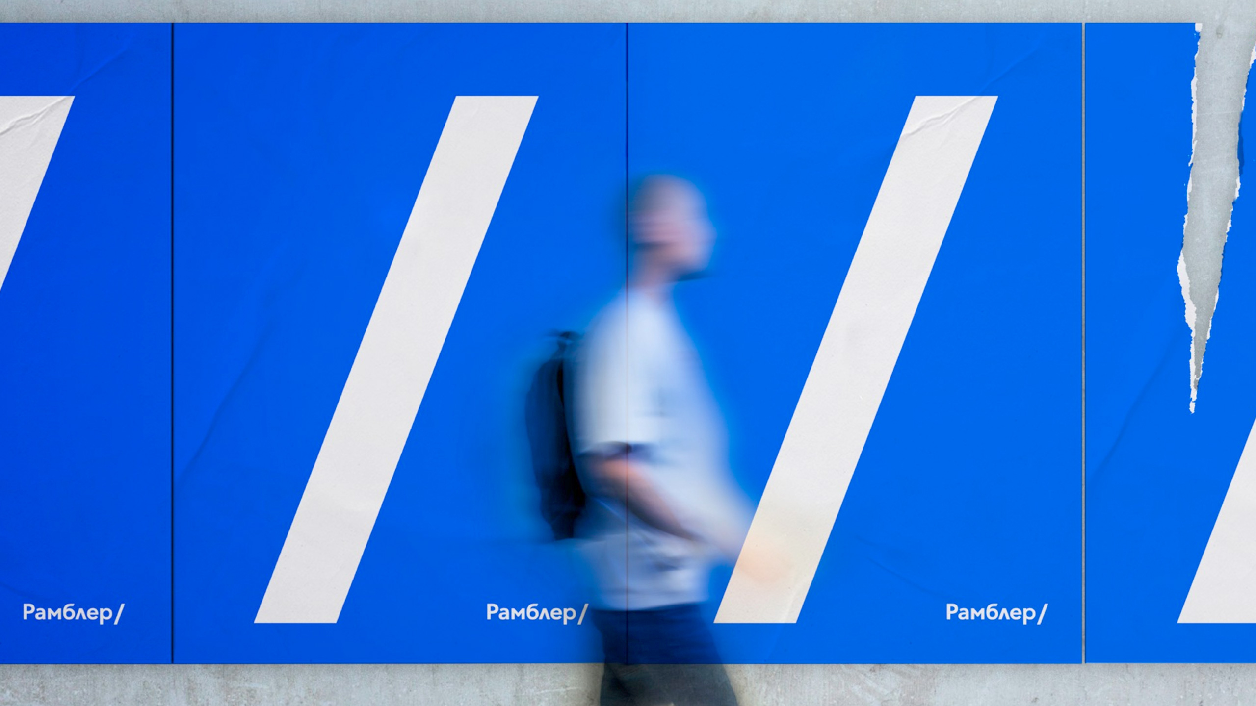
The slash can also be used as a mask for images or as the main element in dynamic pattern creation
